The Process


Client: Dr. Robert Bowen
Project: Secondary logo mark for print collateral
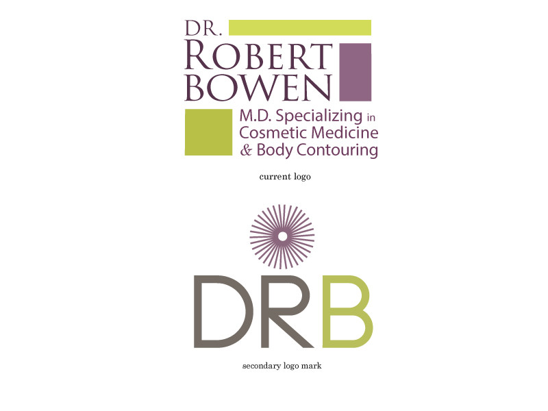
Dr. Robert Bowen specializes in body contouring and cosmetic surgery and was looking for a complementary secondary mark for their print collateral such as invoices and letter heads. The mark needed to incorporate their brand’s colors and be less text heavy than their current logo.
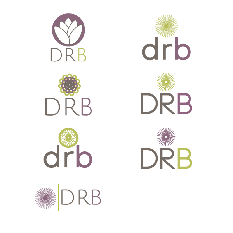
The first step in the process was to research other cosmetic surgery branding for the purpose of establishing any standards used in that industry. Most cosmetic surgery offices profiled online featured abstractions of women’s bodies or faces or soft curved lines. I decided to take a different approach and use a design that represented the golden ratio, the mathematical standard of symmetry and beauty. A line segment was repeated to create a design that had movement, complexity, and symmetry. A sans serif font was paired with the image to contrast with the primary logos serif. I went through several iterations of the logo as seen in my process. I stayed with the core principal of the golden ratio but tried different shapes and fonts before settling on the final version.
